Branding for start-up tourism company with social justice focus
client
Trips+
project summary
Naming, Logo, brand style guide and
social media assets
Team
Catherine Dinkelmann
―
Trips+ is a start-up tourism company founded by social entrepreneurs with the aim to use business to support remote communities in the Philippines in need, through tours for medical specialists to join local Philippino medical teams, training and supporting them in their work, and for holidaymakers to use their skills to engage with and make a difference in the Philippino community.
The brief was to create a simple and easy to understand brand-identity, with corresponding styleguide outlining font and own-able colour scheme for the brand, and bring these to life with social media assets.

The outcomes:
1.
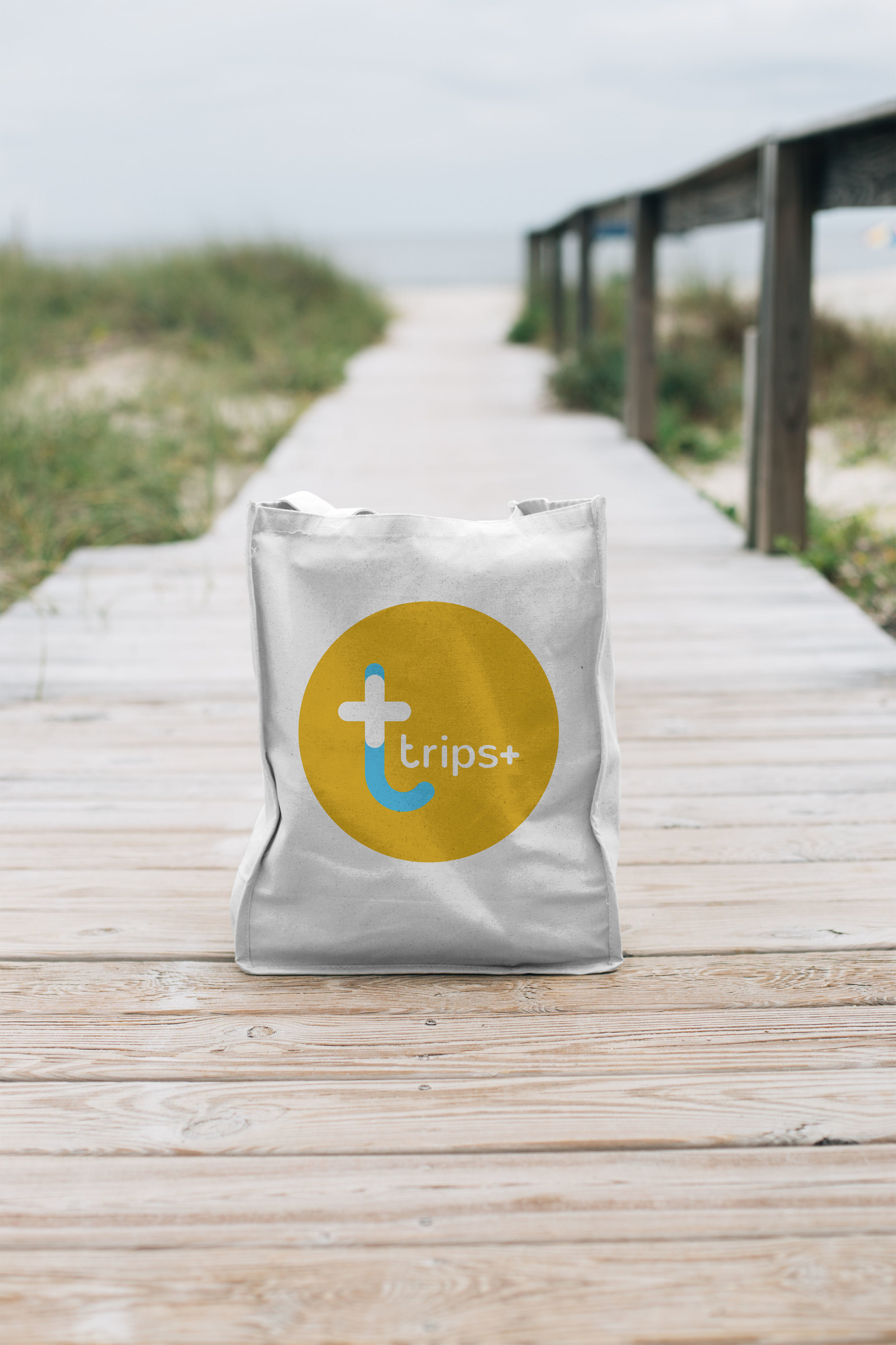
Upon receipt of the initial name, Cornerstone Tours, an extensive audit was done of similar ventures and names already in use in the market place. Concerns about cluttering the market place with a brand name that was already widely in use, resulted in a re-think of the name. A final decision was made to use Trips+ with the tagline: Holidays with purpose.
2.
The new logo is a clean logo with the t and the + sitting overlapped to form one element. It speaks of unity, simplicity and defined purpose, while the lower case is also indicative of a down-to-earth grass-roots approach. The colour Aqua is a friendly and happy colour that also speaks of sensitivity and compassion. The yellow grabs attention. It is playful, warm and joyful and in the circle shape resembles the sun.
3.
A series of warm sunset imagery for social media, to speak of holidays bringing hope.