Visual identity for community art award/festival
client
Immanuel Lutheran College, Arts Festival
project summary
Re-brand, Posters, Signage, Exhibition catalogue, Curating of art exhibition
team
Catherine Dinkelmann, alongside a
team of parent volunteers and staff
―
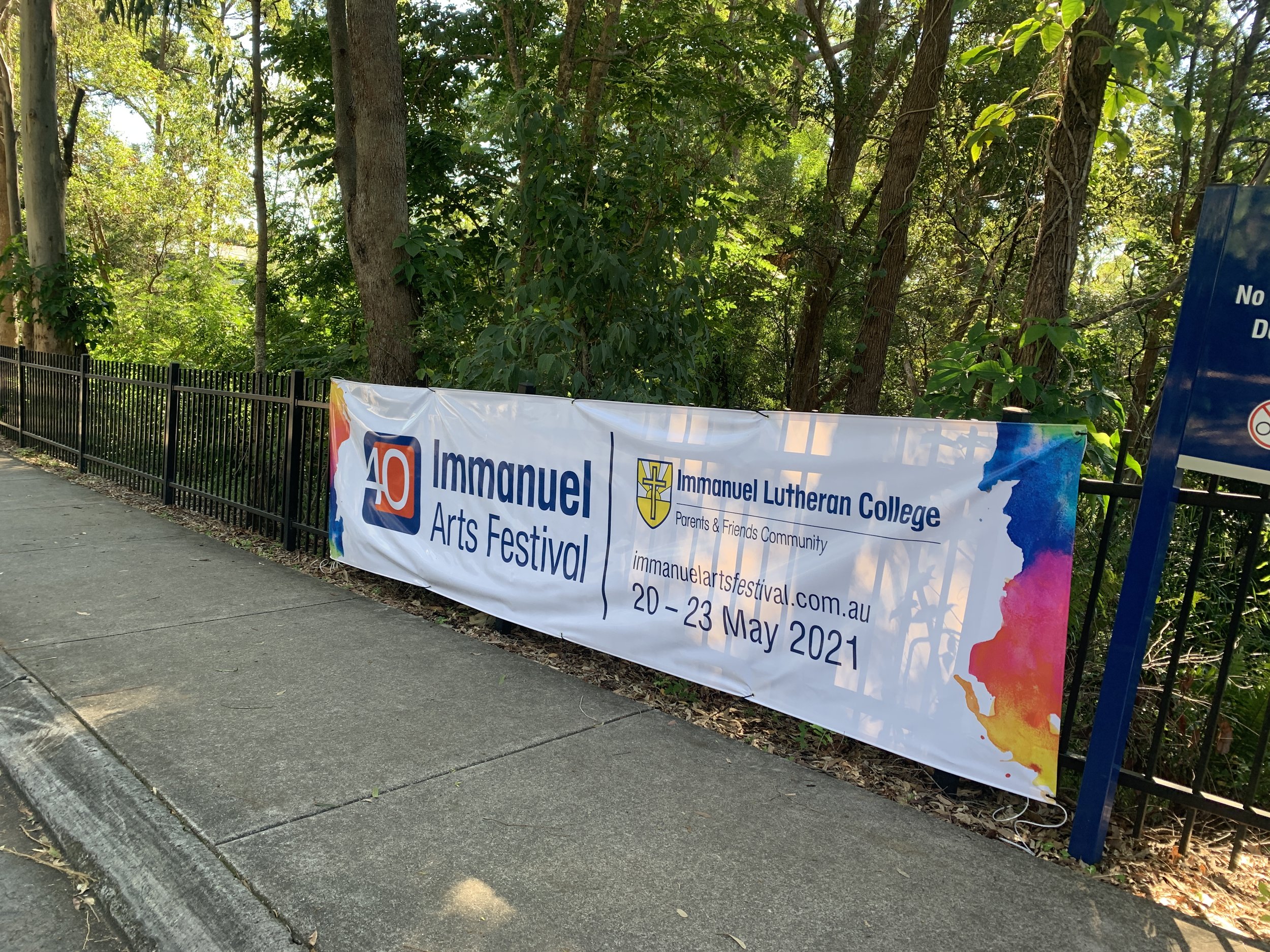
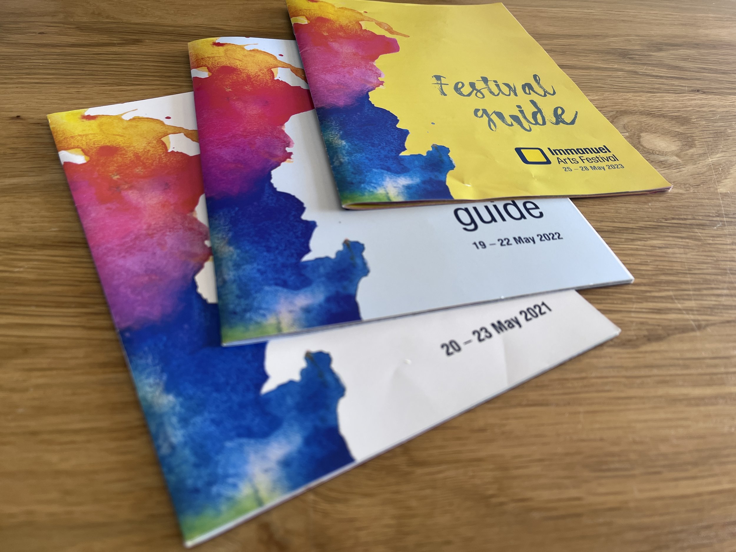
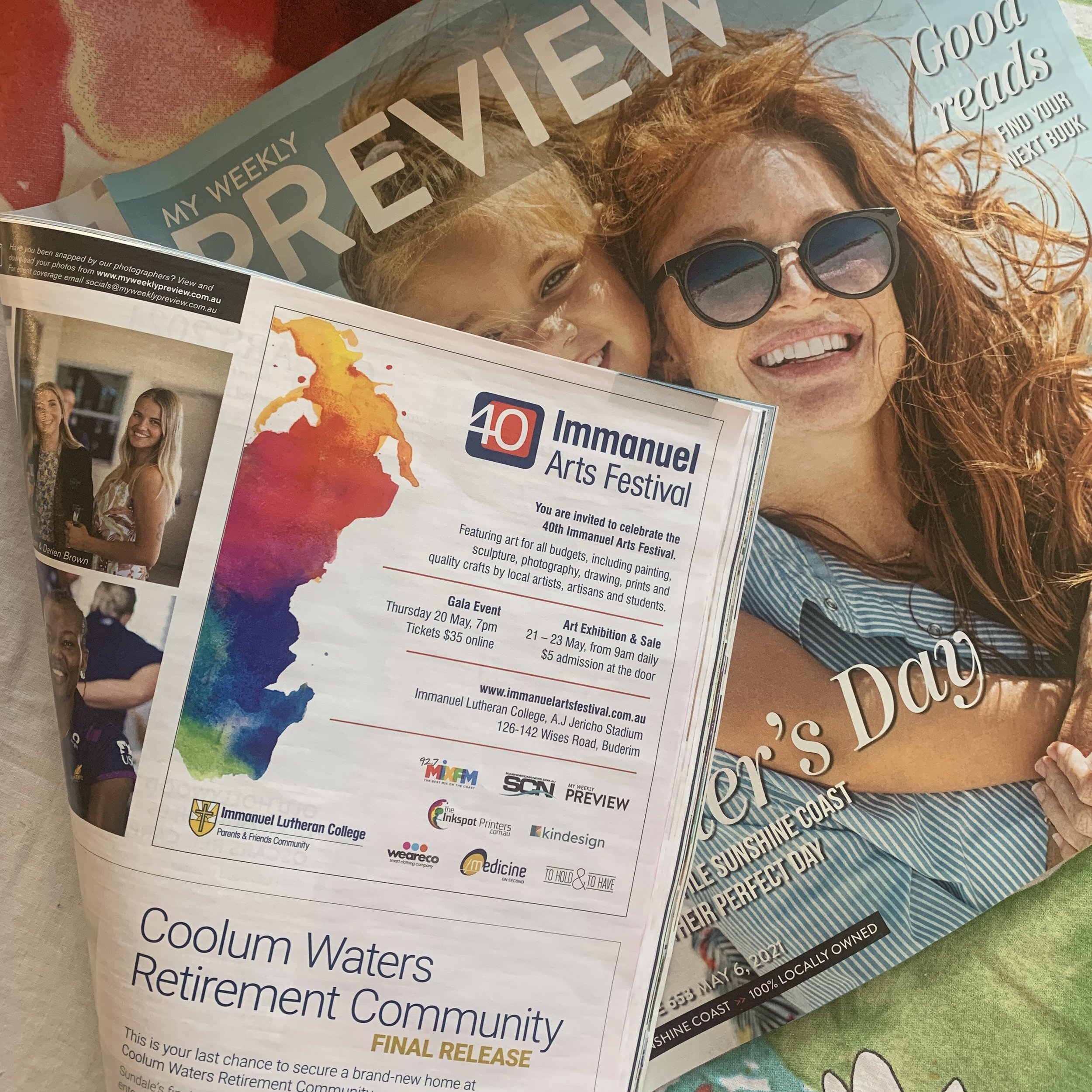
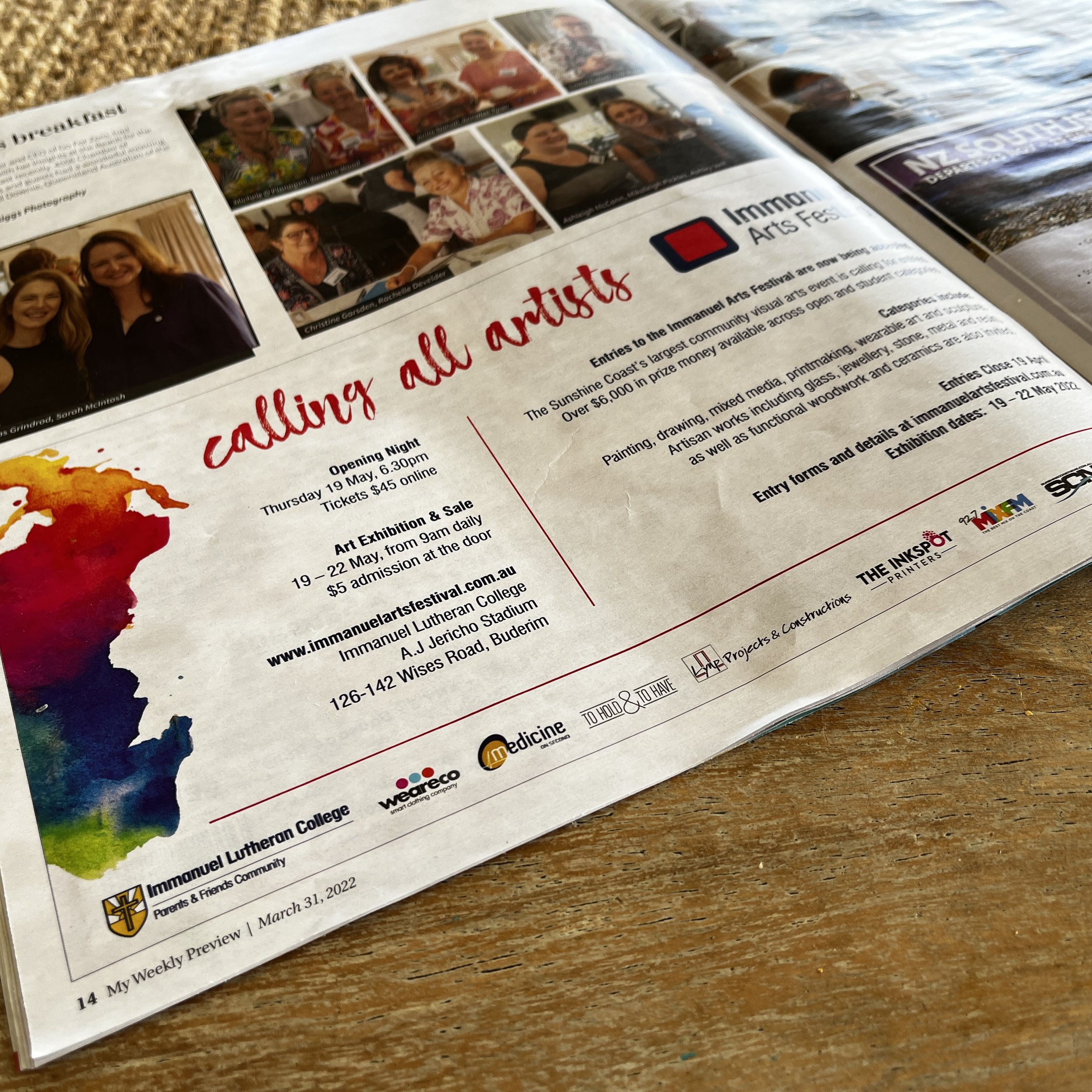
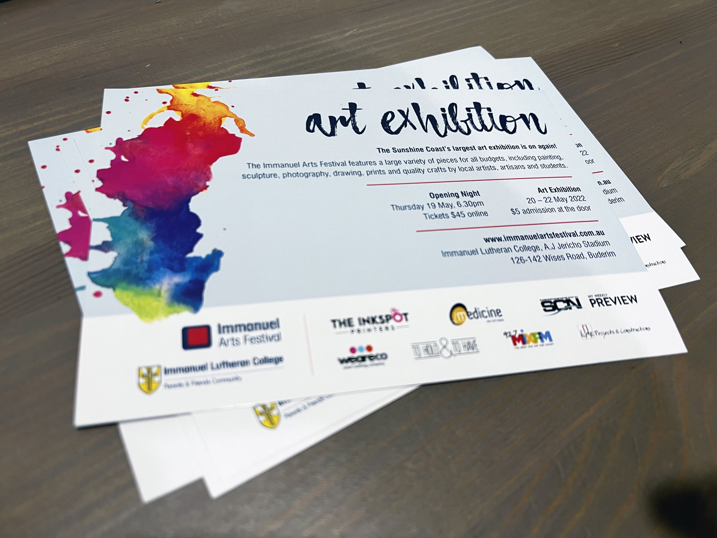
The refreshed branding for the Immanuel Arts Festival was done to commorate the 40th anniversary of the festival. A custom paint splash graphic was also created as branding element for the festival. This is now in use accross all marketing material for the Immanuel Arts Festival.
As a Gold Sponsor of the Immanuel Arts Festival this work was all done in kind.
What we’ve accomplished:
1.
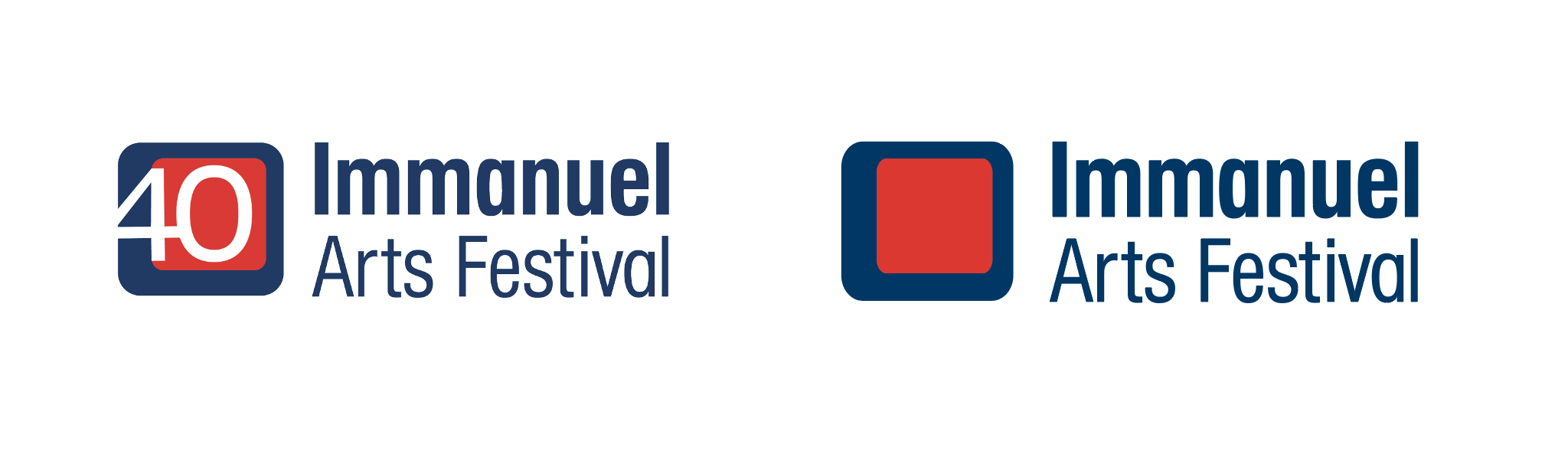
A new visual identity for the Immanuel Arts Festival.
The new logo was based on the original Arts Festival logo using the same blue colour.
The font family chosen is the same as the Immanuel Lutheran College logo, to better tie in visually with the school’s brand and therefore serve as an extension to the college’s promotional suite.
The idea is that each year a different colour would be chosen for the inside of the frame, therefore giving each year a unique flavour while all still tying in together as a whole.
For the fortieth year a 40 is placed inside the frame it to emphasise this amazing milestone.
2.
In the first year of rolling out this new visual identity, the overall income generated by the Arts Festival more than doubled to over $50 000!
3.
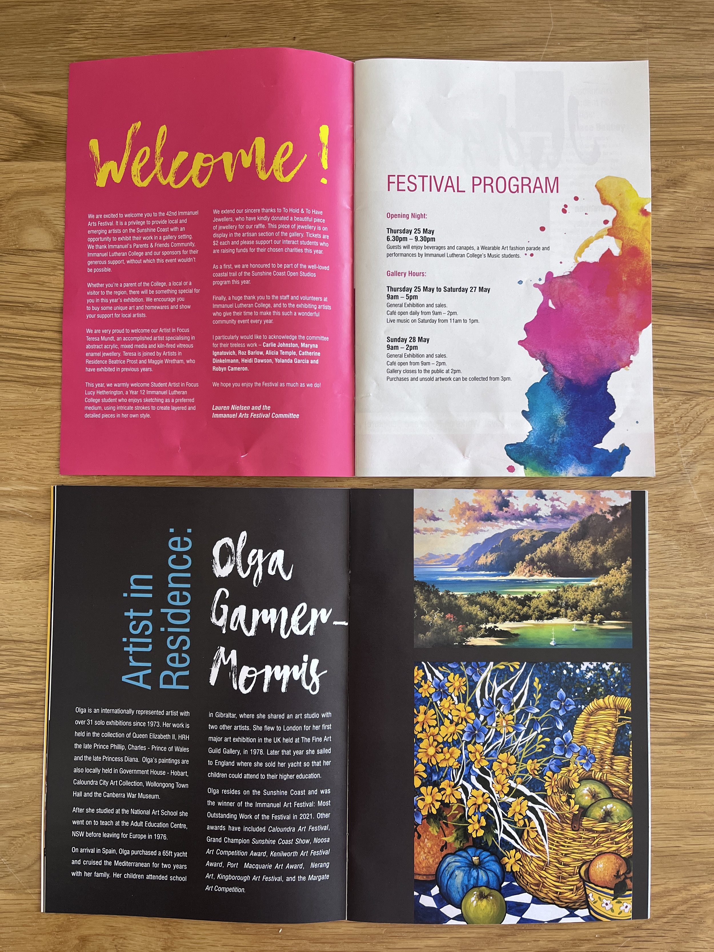
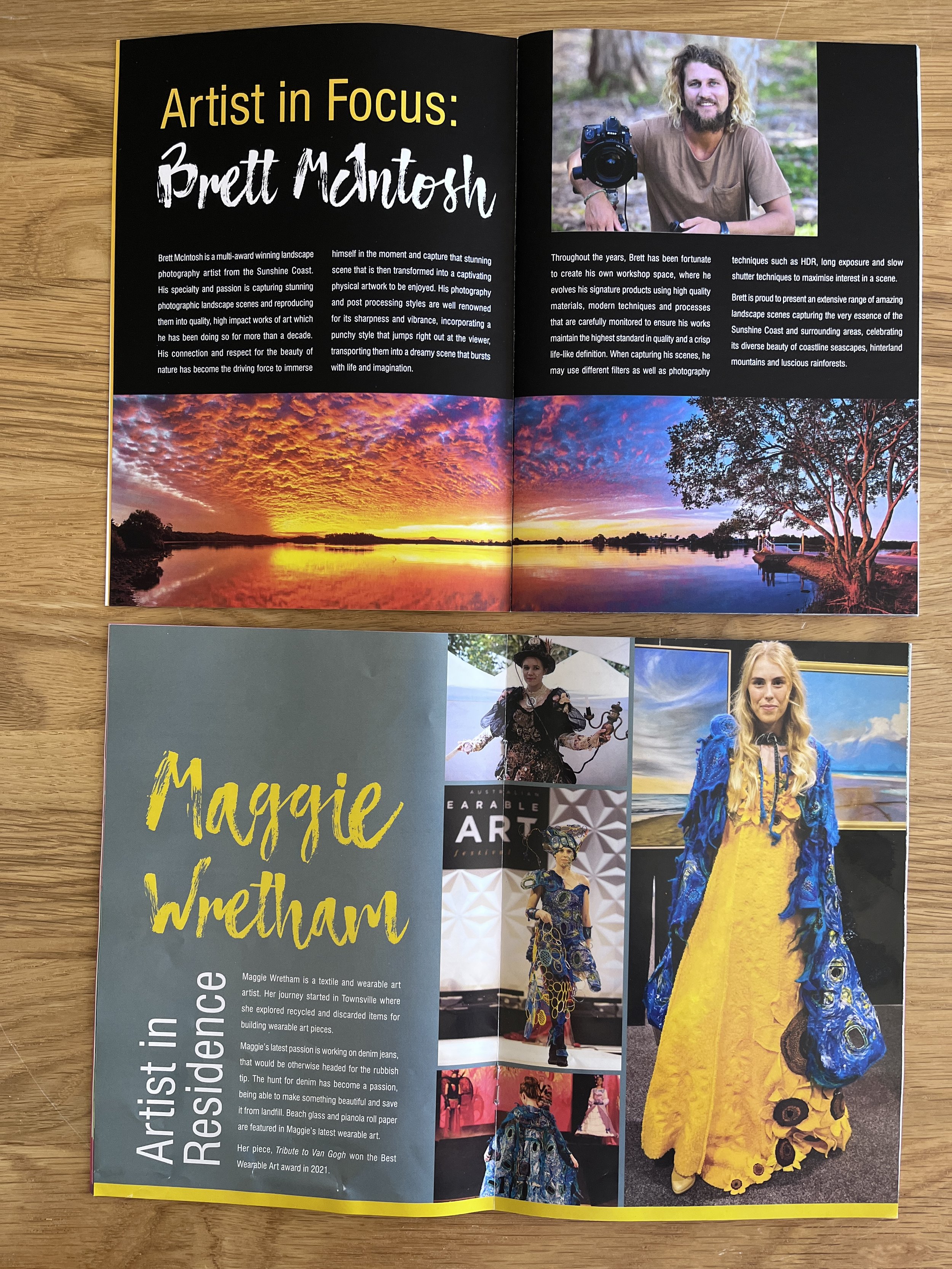
Using my experience in gallery curating and exhibition layout the overall presentation of the exhibition has steadily been improving over the years. In 2023 an extensive participation survey was developed to get accurate feedback on which to base future direction and decision-making around the festival.