Visual identity for a faith community
client
Gracepoint
project summary
Re-brand, Interiors, Signage, Collateral, Values campaign
team
Catherine Dinkelmann
Kimberley Gaskin (campaign copywriter)
―
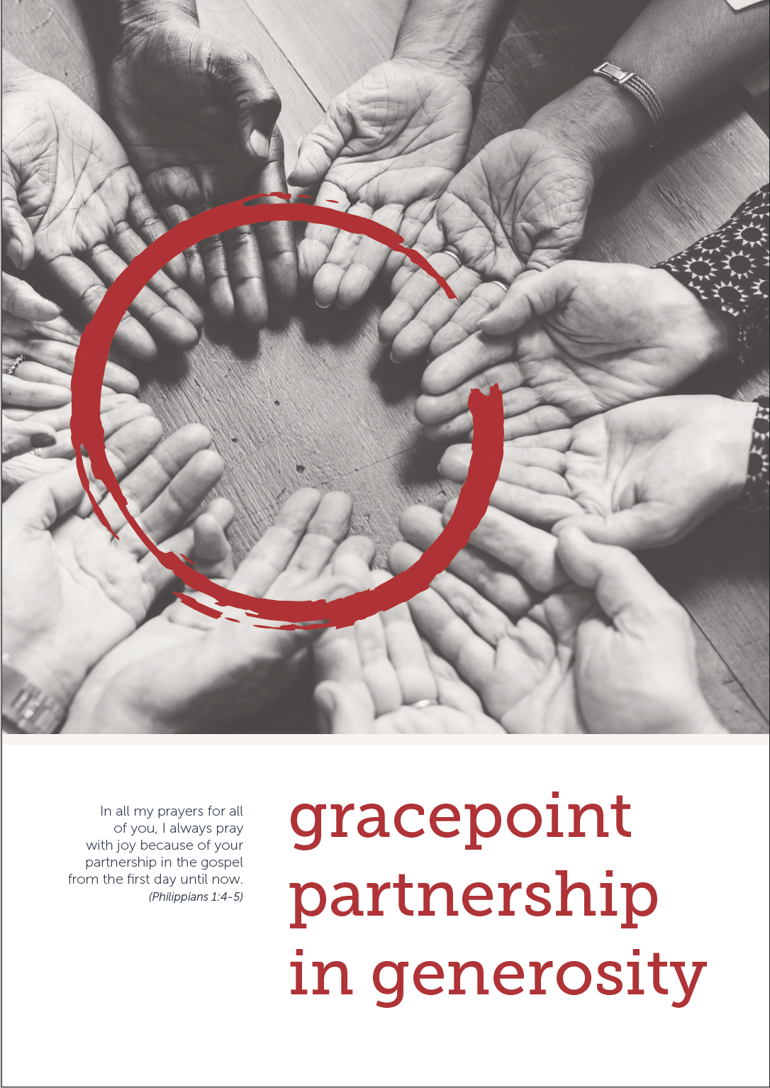
Media stereotypes often paint churches as irrelevant and old-fashioned religious groups with hard wooden pews and pulpits. Gracepoint Christian Church is a far-cry from that - with a love for people and a heart for fostering a sense of belonging and community. Their community playgroups are full to capacity servicing mums and toddlers from the local area. Recently they did a spare-coin fundraiser to buy a new tumble dryer for the John Brotchie preschool a few doors down the road. They just love being generous and actively involved in their local community.
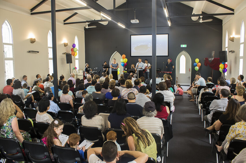
Gracepoint engaged me to help them rethink their visual identity as they had acquired a new (over a hundred year old) church building in Botany. They wanted a clean modern logo without clichés, which emphasised their personality as being authentic, warm and open, and valuing people.
They also needed advice on the interior design and décor of their new building – all the way from signage to wall colours, and everything in between, as well as updated marketing material to communicate what they are on about.


What we’ve accomplished:
1.
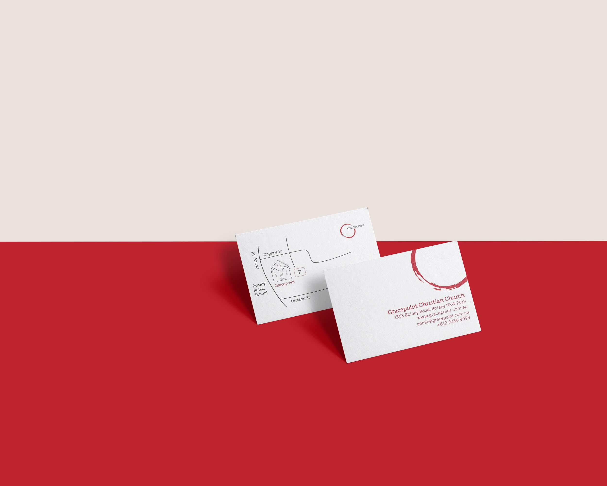
Gracepoint now has a new visual identity and accompanying brand guidelines.
The logo features a red wine stain referencing communion – a central element of the faith.
It speaks of authenticity (the red circle is imperfect; the ratio between the word and the shape is slightly unbalanced to steer away from coming across as being perfect and expecting one to be perfect.)
The circle speaks of a safe space to come and explore faith
It is warm and open (the red circle is not closed; red is a warm colour)
The font choice and imagery is fresh, clean and contemporary to make the image of the church more relevant in today’s society.
The colour-palette speaks trustworthiness, warmth, love, humility and stability.
2.
The new church building and community spaces are painted in colours from their newly developed brand guidelines, with complementary floor coverings and furniture. It has been done in a way that emphasises the heritage features of the building but has a modern and contemporary feel with a café at the entrance.
3.
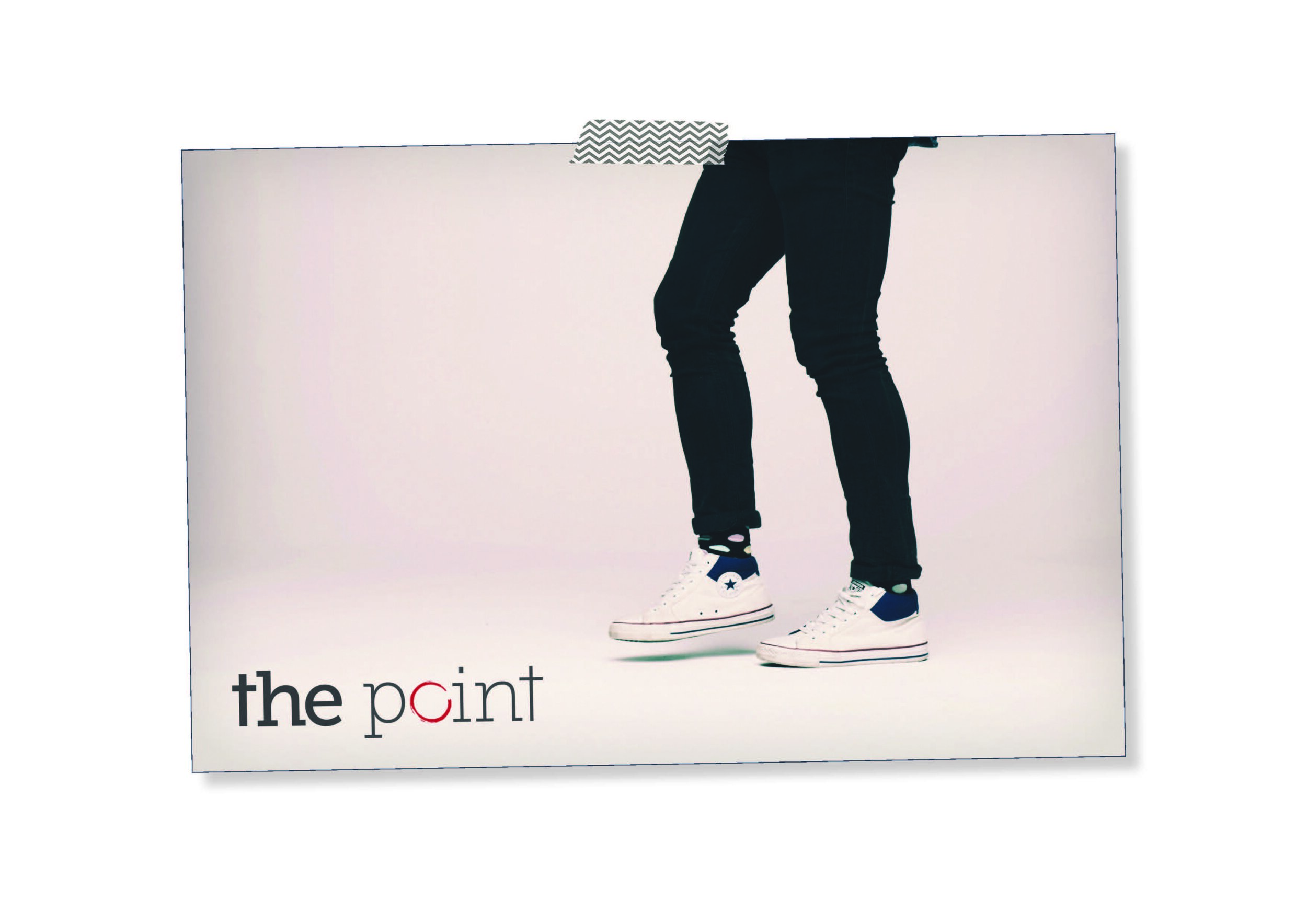
The church wanted a contemporary, ideas-led way to launch its new values and mission statement, so we created the #lovetruthpowergo campaign. The campaign focused on a lock up comprising a compelling new strap line and a series of modern icons to anchor the four key values of the church. The lock up was used on a series of creative executions that reflected each value, featuring engaging, unexpected word play and imagery. The executions also used a blown out light element as a unifying feature across the creative platform.